Case study · SEDA · 2026

SEDA Design System

I built SEDA's first design system in 2024 to give the explorer one language. In April 2026, I rebuilt it: calmer, sharper, and ready for products customers would trust with their keys.

Role
Head of Product. Design, documentation, developer handoff
First build
Aug – Sep 2024
Revamp
April 2026
Built on
shadcn, documented in Notion
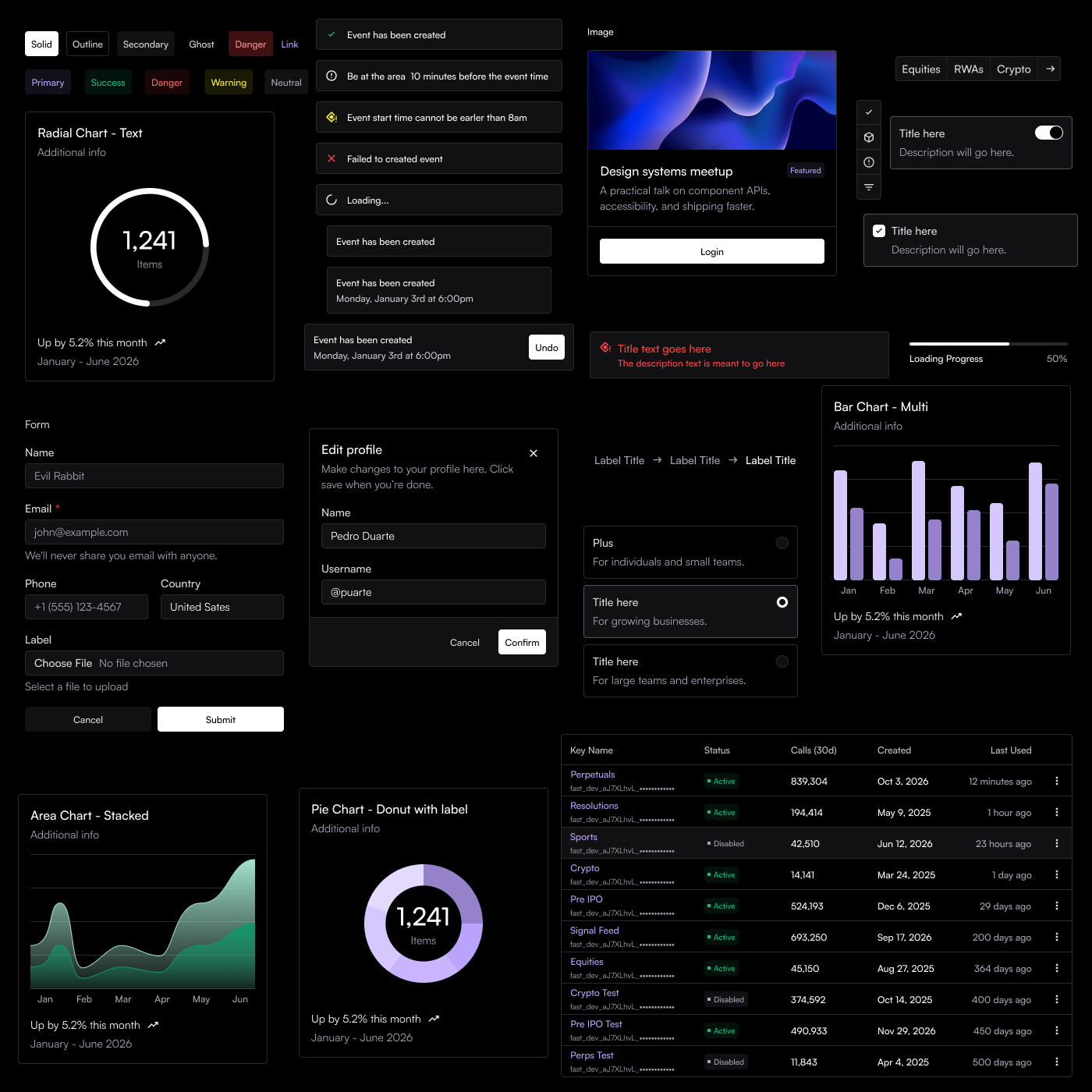
Components from the revamped SEDA design system: buttons, badges, toasts, cards, forms, dialogs, radio cards, charts and a keys table

Why revamp

The 2024 system did its job: it gave the explorer a consistent look and let the team ship new pages fast. But it spoke crypto: neon purple, all-caps labels, glowing gradients.

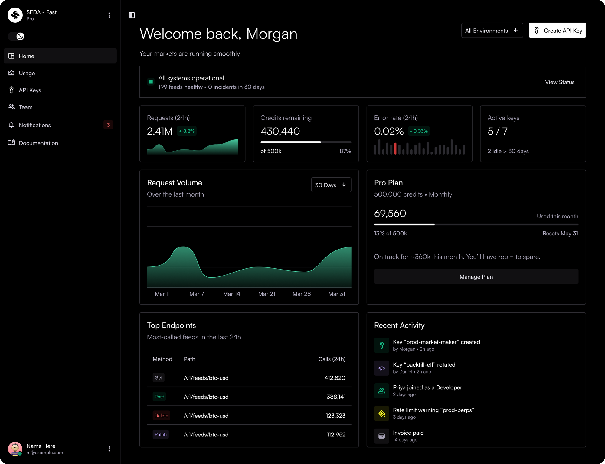
SEDA Fast was a different kind of product: a dashboard where customers manage the keys to their data. It needed to feel professional and trustworthy. It was also self-serve, so it needed components the explorer never had: richer charts, toasts, and the building blocks for billing and team management.
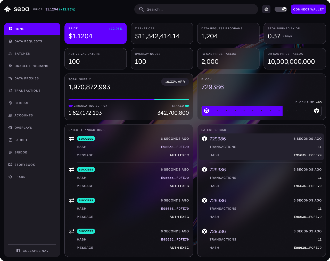
2024The 2024 system in the explorer dashboard: purple accents, all-caps labels, glowing gradients and a side navigation
The first system, in the explorer.
2026The 2026 system in the SEDA Fast dashboard: neutral surfaces, quiet stats, charts and a side navigation
The revamp, in SEDA Fast.

What changed

Two tracks running in parallel, so engineers never waited on a finished system.

FoundationsColour, typography and tokens. A more neutral palette for a more professional tone, and type moved from Formular to Satoshi.
Component library22 components, each a thin wrapper on shadcn, fully documented in Notion.

The system

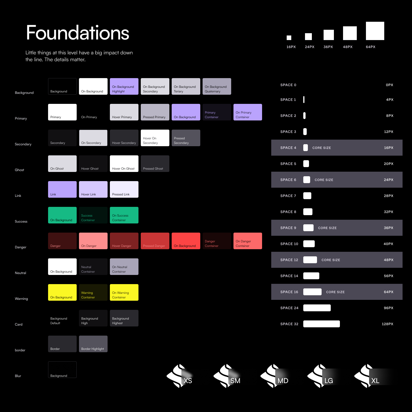
Foundations: semantic colour tokens for background, primary, secondary, ghost, link, success, danger, neutral, warning, card, border and blur; a spacing scale from 0 to 128px with core sizes; icon sizes from 16 to 64px; and logo sizes XS to XL
Foundations. Semantic colour tokens, a spacing scale with core sizes, and icon and logo sizes.
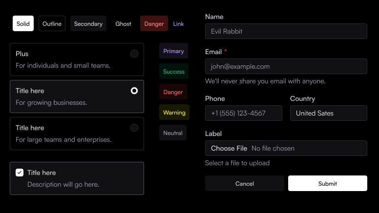
Primitives: button variants, status badges, radio cards, a checkbox card and a form with text, phone, country and file inputs
Primitives. Buttons, badges, radio and checkbox cards, and form inputs.
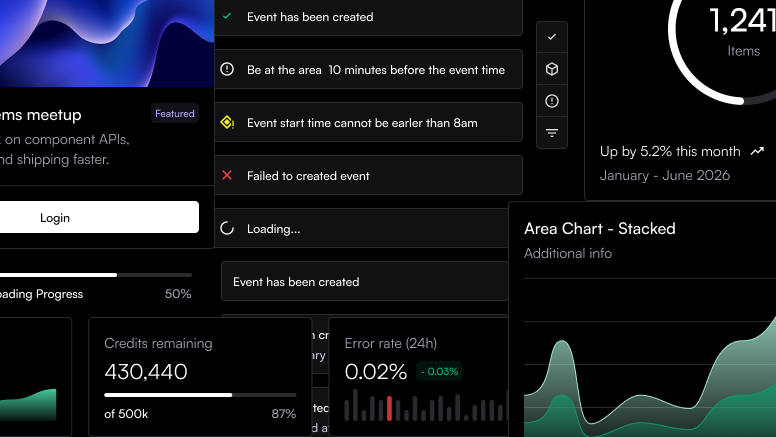
New components for SEDA Fast: success, info, warning, error and loading toasts, stat cards with sparklines and progress, a radial chart, a stacked area chart and a featured card
New for SEDA Fast. Toasts for every state, stat cards and charts built for usage data.

Key decisions

Three decisions, and each one made the next easier.

MUI 3shadcnshadcn's defaults were already close to the look we wanted, so the base did most of the component work. It's also easy for designers and developers alike: ready-made Figma kits, thorough docs that developers love, and a strong chart library.
FormularSatoshiA typeface sets the tone of a whole product. Switching it changed everything at once: simpler, cleaner, less futuristic and more professional, exactly what we wanted to say.
Colour firstNeutral firstWith the type in place, colour was next. A muted palette, more neutral tones, and a stricter rule for when colour earns its place over something neutral.

Documentation

If docs are useful, people use them. If they're confusing, no one does. I documented the whole system in Notion, from foundations down to every token and value, so designers and engineers could move fast without asking.

Pages link to each other, so a spec never stands alone: a component that uses core sizes links straight to the core sizes page. Every page carries visual references and links back to its source in Figma, so nobody has to guess what a component should look like.

The docs, recreated. Foundations down to tokens and values, then a page per component: visual references, specs, nested components, guidelines, behaviour and viewport position, each linked to Figma.

Outcome

When a new engineer joined, he told me the docs gave him everything he needed to build the system.

And one system now carries both SEDA's product and its public face.

SEDA FastEvery screen of the customer dashboard, from sign-in to keys, usage and settings.See the case study →
seda.xyzThe SEDA website, launched in April 2026 on the same system, so the site and the product finally look like one company.

Looking back

The revamp came out far better than the original, and the reason wasn't skill. In 2024 there was no time to stop and ask why. I had to start shipping components straight away. In 2026 I had room to think, and to pitch a direction before building it.

That's the lesson I keep: give designers time to understand why a choice is right, and the system holds together on its own.